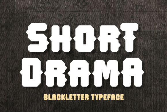
Short Drama: A Bold Blackletter Font for Digital Impact
As a UI designer who ships dozens of landing pages, SaaS dashboards, and e-commerce experiences each year, I don’t reach for blackletter fonts lightly. They carry weight—historical, typographic, emotional. Short Drama is the rare blackletter typeface that doesn’t feel like a costume. It’s minimalist without being sterile, dramatic without sacrificing clarity, and distinctly digital in how it holds up across devices and contexts.
At its core, Short Drama reimagines blackletter for the screen. Its letters are built on clean, intentional lines—not ornate flourishes or dense texture. The bold weight anchors headlines instantly; the subtle angularity in terminals and stems adds rhythm without visual noise. It’s not a revival—it’s a reinterpretation. That makes it unusually versatile for web designers who need personality *and* precision.
Where Short Drama Earns Its Place on Screen
This isn’t a body text font—and it shouldn’t be. Short Drama shines where hierarchy, tone, and instant recognition matter most:
- Hero section headlines: On a coaching website or creative portfolio, “Your Vision, Amplified” in Short Drama reads as confident, human, and memorable—especially against a muted background or subtle gradient.
- Landing page CTAs: Used sparingly on buttons like “Start Free Trial” or “Join the Studio”, it adds gravitas without sacrificing scannability—provided the button has ample padding and contrast.
- Branded banners and shop headers: For boutique online stores or limited-edition product drops, Short Drama elevates banners above generic sans serif treatments—communicating craft, intention, and distinction in under three words.
- Course and digital product pages: When launching a premium workshop or design toolkit, Short Drama in the headline signals quality and authority before the first sentence loads.
- Blog headers and social media graphics: Paired with a clean sans serif body (like Inter or Manrope), it creates strong visual rhythm in newsletter headers or Instagram carousels—ideal for creators building a consistent brand voice.
Readability & Responsiveness: Practical Considerations
Short Drama performs reliably down to ~32px on desktop and ~28px on mobile—but only for short phrases. Never use it for paragraphs, navigation labels, or form fields. Its strength lies in brevity and contrast.
On light backgrounds, pair it with dark charcoal (not pure black) for softer impact. On dark backgrounds, use crisp white or off-white—avoid yellow or pastel overlays unless carefully tested for WCAG AA contrast. When placed over images, apply a subtle semi-transparent overlay or text shadow to ensure legibility at all viewport sizes.
It renders cleanly across modern browsers and supports standard Latin character sets. If your project requires extended language support (e.g., Central/Eastern European diacritics), verify the included glyph set before licensing—most webfont packages include basic multilingual coverage, but double-check for accented characters used in headlines or taglines.
Smart Pairing for Balanced Digital Typography
Short Drama works best when paired intentionally—not just contrasted. Its blackletter roots mean it pairs naturally with neutral, highly legible sans serifs: Inter, Manrope, or Helvetica Now for UI-driven sites; IBM Plex Sans or Work Sans for editorial or knowledge-based platforms. Avoid overly geometric or condensed sans serifs—they compete rather than complement.
For more expressive brand systems—say, a literary podcast or independent magazine—you can pair Short Drama with a warm, low-contrast serif like Charter or Cormorant Garamond. The key is maintaining clear visual separation: Short Drama for impact, the secondary font for flow and trust.
Never pair it with another display font, script, or handwritten style. Its personality is strong enough to carry the tone alone—adding another decorative layer dilutes clarity and weakens hierarchy.
Licensing, Formats & Real-World Deployment
Short Drama is a premium font designed for commercial use—including client websites, SaaS interfaces, Shopify themes, digital templates, and branded marketing assets. Ensure your license covers webfont hosting (WOFF2 format is ideal for performance) and unlimited pageviews if deploying on high-traffic sites.
Most reputable vendors provide variable font files or discrete weights (Regular, Bold). While Short Drama currently offers one primary weight, its design compensates with inherent visual density—so you rarely need lighter or italic variants for emphasis. Use spacing, color, and size instead.
When integrating into a design system, define strict usage rules: “Short Drama is permitted for H1s, hero subheads, and CTA buttons only. Never used below 24px or in mobile navigation.” This protects both brand consistency and user experience.
A Font That Supports, Not Overrides, Your Design Intent
In an era of interchangeable sans serifs and algorithmic minimalism, Short Drama stands out—not by shouting, but by stating something clearly and unmistakably. It supports brand tone without demanding attention. It builds hierarchy without confusing users. And it scales across touchpoints—from a tiny app icon badge to a full-screen hero—because its shapes are purpose-built for pixels, not parchment.
Use it where your message needs presence: a founder’s name on a portfolio, a course title on a sales page, a limited-run collection banner in an online shop. Let it do the heavy lifting once—then step back and let your content, layout, and interaction design take over. That’s how great typography serves design, not the other way around.